
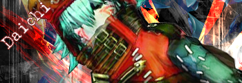
The only reason that i post this, is that i'll like to have my 1000'th post in my beloved thread. about 30% of my posts is in here, two years of sig-making happiness is lying inside. I have changed a lot in my style of sigs, since my first post on page 11, or so. But the two main reasons to my sigmaking are Wander and Astra, who both encouraged me, and tought me about Photoshop.
And this post also goes to the kind-hearted persons, who took time to rate my sigs, and i know, i sometimes get frenzy, and post 40 sigs at a time, (whitch made it even harder to rate due the heavy load).
But before i push the send button, i'll like to thank Astra again. Thanks a lot, dude! you actually gave me a future job.
~Daichi
Avatar And Signature Rating Topic
Moderator: Moderators
-
Haseo{Terror of Death}

- Protagonist
- Posts: 3682
- Joined: Sun Apr 22, 2007 12:02 am
- Location: "...in the rift between consciousness and unconsciousness of all souls..."
Re: Avatar And Signature Rating Topic
Now that I know who's in your sig, I'll post^^
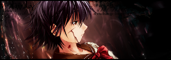
Daichi, 7/1o and 8/10, they are both wonderfully done, but they are fairly simple, but they do seem effective, it is very epic-able, but not just yet epic
Daichi, 7/1o and 8/10, they are both wonderfully done, but they are fairly simple, but they do seem effective, it is very epic-able, but not just yet epic
No matter how high the wall. No matter how thick. My love surmounts them all. Like a bird. Flying to you. Forever and ever.

Re: Avatar And Signature Rating Topic
Quite the 1000th post Daichi. But the thanks isn't necessary. I'm here to help any one who needs it. You improved quite a lot, so great job Daichi.Daichi wrote:The only reason that i post this, is that i'll like to have my 1000'th post in my beloved thread. about 30% of my posts is in here, two years of sig-making happiness is lying inside. I have changed a lot in my style of sigs, since my first post on page 11, or so. But the two main reasons to my sigmaking are Wander and Astra, who both encouraged me, and tought me about Photoshop.
And this post also goes to the kind-hearted persons, who took time to rate my sigs, and i know, i sometimes get frenzy, and post 40 sigs at a time, (whitch made it even harder to rate due the heavy load).
But before i push the send button, i'll like to thank Astra again. Thanks a lot, dude! you actually gave me a future job.
~Daichi
Anywho, back to the rating.
ToD:
sig: Very nice sig Alkaid...She improving quite a lot as well. 9/10 the blur on his side is very fitting for the atmosphere.
avi:
9/10 a bit monochromatic, but points for Sora, and the pose is awesome.
i'd like this old one rated...i haven't made much since i started tutorials.
it's just a quick remake of one i made a while ago. this one's fairly old as well though.

Sig by Alkaid_Loves_Haseo (my awesome sis!), Avi by me! Thanks!
Click the Sig for all my work.
Click here for Astra's signature tutorials!
Alkaid_loves_Haseo wrote:I hereby adopt you as my brother.
AuraTwilight wrote:Wow, Astra. Pwn.
-
Cruel Ruin

- Posts: 141
- Joined: Wed May 18, 2005 9:11 pm
- Location: Angel's Sanctuary
- Contact:
Re: Avatar And Signature Rating Topic
Avatar: 9/10 I really like it. It's got that clear effect I like. The only thing keeping it away from a 10/10 is a decent border and it being square. Still I like it.
Sig: 9/10 again. I like that type of style for sigs. You have pure black border. I believe a lighter 1 pixel border with some opacity might do better. That's just me. I also think more should be happening on the right side of the sig. You have so much space for something.
Sig: 9/10 again. I like that type of style for sigs. You have pure black border. I believe a lighter 1 pixel border with some opacity might do better. That's just me. I also think more should be happening on the right side of the sig. You have so much space for something.
 Vist Aku's and my anime blog
Re: Avatar And Signature Rating Topic
Cruel Ruin...i haven't seen you in forever...the very creator of this topic. where have you been? nice to see you back anyways.Cruel Ruin wrote:Avatar: 9/10 I really like it. It's got that clear effect I like. The only thing keeping it away from a 10/10 is a decent border and it being square. Still I like it.
Sig: 9/10 again. I like that type of style for sigs. You have pure black border. I believe a lighter 1 pixel border with some opacity might do better. That's just me. I also think more should be happening on the right side of the sig. You have so much space for something.
Sig: 9/10 looks good, i like the colors, and Tsubasa was aweosme. though it seems like mainly brushes and a render, try some C4Ds ^_~
Avi: 8/10 Same as the signature for the most part, but i don't like the white. try taking a color from the render, lightening it up a bit, then using a grad map set to color at about 30-45% opacity.
Thanks for your input...my old avi, was the same picture, but it was a square border, and i didn't like the looks, so i decided to take a piece out XD
anywho, the sig you rated was a remake of:
less contrasted colors was my main goal. and my borders are a 1 px black line on top, and a 1 px black line on the bottom. - always. i'm not a fan of the full -all the way around the sig- border.
anywho...i'd also like this signature rated, though disregard the crappy text...i fixed it when i made the tutorial for it (click the link in my signature)
Sig by Alkaid_Loves_Haseo (my awesome sis!), Avi by me! Thanks!
Click the Sig for all my work.
Click here for Astra's signature tutorials!
Alkaid_loves_Haseo wrote:I hereby adopt you as my brother.
AuraTwilight wrote:Wow, Astra. Pwn.
-
Cruel Ruin
- Posts: 141
- Joined: Wed May 18, 2005 9:11 pm
- Location: Angel's Sanctuary
- Contact:
Re: Avatar And Signature Rating Topic
Yeah, I've been stalking the forums every now and then. I haven't been up to much. Been watching tons of anime and going to college. Thanks for remembering me and the advice also. I liked the avatar, but I did want to try something different on it. Tsubasa was awesome! You kept up with Tokyo Revelations?Astra wrote:Cruel Ruin...i haven't seen you in forever...the very creator of this topic. where have you been? nice to see you back anyways.
First sig: 9.5/10. Anyways, I like that sig you started with much better. The text makes it feel more complete. The colors I like still. Only thing I really say improve on is the text just a bit.
Second sig: 10/10. Saber wins it for me. I also like the blue in it. Good job!

Re: Avatar And Signature Rating Topic
Cruel Rain:
Sig - 8/10
avatar - 5/10
The signature is good, but...hmm..seems to be missing something.
I'm back because I want to know what people think of my new one :3 I used Astra's tutorial for this one.
Again - don't rate the avatar ;3 it's not mine.
Sig - 8/10
avatar - 5/10
The signature is good, but...hmm..seems to be missing something.
I'm back because I want to know what people think of my new one :3 I used Astra's tutorial for this one.
Again - don't rate the avatar ;3 it's not mine.

I'M SORRY! SORRY ABOUT BEING A DICK BUT SOMETIMES IT'S HARD TO SUPPRESS THE URGE OF RUINING OTHER PEOPLES LIVES!
Re: Avatar And Signature Rating Topic
well.....
sig: 8.5/10
a tad too big, and overcontrasted..... well... i can't see what of the tuts is used... anyways. the font/Text is superb, and the render itself...
Just much empty space, snt small stuff....
EDIT: OMG!? why is .PNG soooooo jumpy on Ie.....
sig: 8.5/10
a tad too big, and overcontrasted..... well... i can't see what of the tuts is used... anyways. the font/Text is superb, and the render itself...
Just much empty space, snt small stuff....
EDIT: OMG!? why is .PNG soooooo jumpy on Ie.....

Re: Avatar And Signature Rating Topic
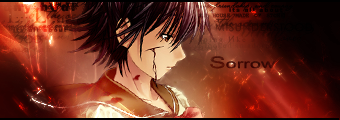
Daichi:
Avi: I can't see anything wrong with it. 10/10
Sig: Maybe a little less lighting on his face? 9/10
New sig. Please go easy I plated with thi one most I just make it but I played around so please be easy. I'm still one of the beginners.
Avi: I can't see anything wrong with it. 10/10
Sig: Maybe a little less lighting on his face? 9/10
New sig. Please go easy I plated with thi one most I just make it but I played around so please be easy. I'm still one of the beginners.

Re: Avatar And Signature Rating Topic
well, because you're a beginner, we shal jugde harder. the mre qritiqe, the better outcome, right?Adept wrote:Daichi:
Avi: I can't see anything wrong with it. 10/10
Sig: Maybe a little less lighting on his face? 9/10
New sig. Please go easy I plated with thi one most I just make it but I played around so please be easy. I'm still one of the beginners.
awy: aww..... try with matching colours..... 4/10
Sig: too much void areas. the C4D is supossed to be a SFX, not the background itself. and the font is crappy. 5/10
oh. and both is suffering from major grainniness
Re: Avatar And Signature Rating Topic
randomly jumpin' in~~~
Adept, save your work as a .PNG, you're saving them as .Jpg, and it's killing the quality...literally, killing it, not to mention it's grainy from the start. also, aside from the fact that you need to find good quality renders, you should place them as an actual focal, that sig isn't very good mainly because the focal the the messed up C4D, you want the render to be the focal, to place the render in the middle...also try a smaller canvas size.
Daichi, you can use a C4D as a background, but it's recommended you put your render over it, and using some clipping masks. i've made a few sigs in that style.
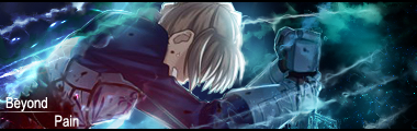
daichi:
avi: a bit dark for my tastes, and the scanlines need their opacity lowered...8/10
sig: Gaara's face is much to bright, but your backgrounds are looking better...9/10
~~~~~~~~~~~
on a side note...i haven't made a signature in ages, so i've got nothing of mine for anyone to rate, i've moved on to a different field of graphics, so for the next person who posts, either rate Daichi's signature and avi, or if you rate mine, all sig credit goes to A_L_H, and my avi, i know is horrible, it was a half-fast one i threw together in about 3 minutes because i was bored.
Adept, save your work as a .PNG, you're saving them as .Jpg, and it's killing the quality...literally, killing it, not to mention it's grainy from the start. also, aside from the fact that you need to find good quality renders, you should place them as an actual focal, that sig isn't very good mainly because the focal the the messed up C4D, you want the render to be the focal, to place the render in the middle...also try a smaller canvas size.
Daichi, you can use a C4D as a background, but it's recommended you put your render over it, and using some clipping masks. i've made a few sigs in that style.
daichi:
avi: a bit dark for my tastes, and the scanlines need their opacity lowered...8/10
sig: Gaara's face is much to bright, but your backgrounds are looking better...9/10
~~~~~~~~~~~
on a side note...i haven't made a signature in ages, so i've got nothing of mine for anyone to rate, i've moved on to a different field of graphics, so for the next person who posts, either rate Daichi's signature and avi, or if you rate mine, all sig credit goes to A_L_H, and my avi, i know is horrible, it was a half-fast one i threw together in about 3 minutes because i was bored.
Sig by Alkaid_Loves_Haseo (my awesome sis!), Avi by me! Thanks!
Click the Sig for all my work.
Click here for Astra's signature tutorials!
Alkaid_loves_Haseo wrote:I hereby adopt you as my brother.
AuraTwilight wrote:Wow, Astra. Pwn.
-
Haseo{Terror of Death}
- Protagonist
- Posts: 3682
- Joined: Sun Apr 22, 2007 12:02 am
- Location: "...in the rift between consciousness and unconsciousness of all souls..."
Re: Avatar And Signature Rating Topic
I got bored after reading Epoch so...

I know it sucks, but for some reason, when I put them all togther it cut off like a pixel
I know it sucks, but for some reason, when I put them all togther it cut off like a pixel
No matter how high the wall. No matter how thick. My love surmounts them all. Like a bird. Flying to you. Forever and ever.
Re: Avatar And Signature Rating Topic
I see your point here I didn't really think about the Avi's background I just kinda through it together. Also I might know why its kinda grainny and thats cause I but Edge Blur on max (11/11) so that might be why.Daichi wrote:well, because you're a beginner, we shal jugde harder. the mre qritiqe, the better outcome, right?Adept wrote:Daichi:
Avi: I can't see anything wrong with it. 10/10
Sig: Maybe a little less lighting on his face? 9/10
New sig. Please go easy I plated with thi one most I just make it but I played around so please be easy. I'm still one of the beginners.
awy: aww..... try with matching colours..... 4/10
Sig: too much void areas. the C4D is supossed to be a SFX, not the background itself. and the font is crappy. 5/10
oh. and both is suffering from major grainniness
Again C4D is not what I use I use a drawing program and I make the pictures how I want. However I am hoping to get C4D or whatever its upgrade is. Oh and I can save them as .PNG I just thought .jpg was better but ok.Astra wrote:randomly jumpin' in~~~
Adept, save your work as a .PNG, you're saving them as .Jpg, and it's killing the quality...literally, killing it, not to mention it's grainy from the start. also, aside from the fact that you need to find good quality renders, you should place them as an actual focal, that sig isn't very good mainly because the focal the the messed up C4D, you want the render to be the focal, to place the render in the middle...also try a smaller canvas size.
Re: Avatar And Signature Rating Topic
C4D is a 3D rendering program.Adept wrote: Again C4D is not what I use I use a drawing program and I make the pictures how I want. However I am hoping to get C4D or whatever its upgrade is. Oh and I can save them as .PNG I just thought .jpg was better but ok.
this is a C4D render:
okay. now i can see who is in your sig. 6.7/10 for removed grainess. i just kinda dislike colour scheme...
avy: same.-
-
Cruel Ruin
- Posts: 141
- Joined: Wed May 18, 2005 9:11 pm
- Location: Angel's Sanctuary
- Contact:
Re: Avatar And Signature Rating Topic
I personally like brushes over C4Ds.
Avatar: 9/10 - a little too dark. Color burn would be nice.
Sig: 8/10 - the sig is too bright. Color burn would be nice again. The pic also is somewhat pixelated since it's an anime screenshot I believe. I would prefer you shrink the pic to make it more clearer.
Avatar: 9/10 - a little too dark. Color burn would be nice.
Sig: 8/10 - the sig is too bright. Color burn would be nice again. The pic also is somewhat pixelated since it's an anime screenshot I believe. I would prefer you shrink the pic to make it more clearer.
-
Mellow Grunty

- Suredeath Hellman

- Posts: 1649
- Joined: Wed Apr 26, 2006 10:22 am
- Location: Sweden
Re: Avatar And Signature Rating Topic
What's so special about C4Ds? Like Cruely said, I prefer brushes, C4Ds stand out too much unless you blend them really well.
Avatar: 5/10 looks like a bad manga scan. Wat.
Sig: 7/10 looks nice, can't really see anything wrong with it.
Minus points for Tsubasa. CARDCAPTOR SAKURA IS SUPERIOR.
Avatar: 5/10 looks like a bad manga scan. Wat.
Sig: 7/10 looks nice, can't really see anything wrong with it.
Minus points for Tsubasa. CARDCAPTOR SAKURA IS SUPERIOR.
Re: Avatar And Signature Rating Topic
C4Ds add a lot more effects then brushes, and look a LOT less monochromatic, especially if it's a good C4D. In my opinion...i don't like renders blended by brushes, i personally like renders blending by smudging, because it looks a lot less choppy, and sharp.
anyways.
Mellow:
Avi: i like the border you used, and the style, the colors are also nice, but the white is a bit strong, and very bright - 8/10
Sig: although i usually like tech brushes, i think you overused them in this signature...also, the left seems WAY too bright...though you're one of like....4 or 5 people here that actually knows how to place a render, so points for that....like i said, i'm not a brush-blended fan, and thus the character's arm looks kinda strange and not fitting, mainly because your sig's lack of depth. sorry if this is offensive to you, but i think you should expand on your style, since it hasn't changed much since i first started making signatures about a year ago. 8/10
Sig by Alkaid_Loves_Haseo (my awesome sis!), Avi by me! Thanks!
Click the Sig for all my work.
Click here for Astra's signature tutorials!
Alkaid_loves_Haseo wrote:I hereby adopt you as my brother.
AuraTwilight wrote:Wow, Astra. Pwn.
Re: Avatar And Signature Rating Topic
Pixelated? PIXELATED?! PIXELATED?! PIXELATED?! i have a full-HDmonitor? dont'ca think i would notice?Cruel Ruin wrote:I personally like brushes over C4Ds.
Avatar: 9/10 - a little too dark. Color burn would be nice.
Sig: 8/10 - the sig is too bright. Color burn would be nice again. The pic also is somewhat pixelated since it's an anime screenshot I believe. I would prefer you shrink the pic to make it more clearer.
If you mean the scanlines, maybe. try go on a higher screen ressolution....
and that pic is a high-quality dvd screenshot. cut down to 30% of original size!?
astra: voted
Cruel-Ruin: voted
Mellow: Didn't vote yet.
Adept: voted like 5 times
Mellow:
Astra's right. the sig is waaaaaaaay to bright. but looks good to me.
8.5/10
awy: 7/10. it just dosen't look good to my eyes.
-
Puppet of the Twilight

- Posts: 93
- Joined: Sun Jan 28, 2007 12:01 am
- Location: Inside of your soda

