
Haseo {Terror of Death}
Avi: 7/10
Sig: 8/10
Avatar And Signature Rating Topic
Moderator: Moderators

Re: Avatar And Signature Rating Topic
Adept:
avi: 9/10 i like it, but it's wayyy over used.
sig: 7/10 i liked the concept, and the quality of the stock, but the text is a little plain
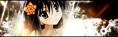
a new vector style sig i made, i'm not too proud of the results, but let me know what you all think:
avi: 9/10 i like it, but it's wayyy over used.
sig: 7/10 i liked the concept, and the quality of the stock, but the text is a little plain
a new vector style sig i made, i'm not too proud of the results, but let me know what you all think:

Sig by Alkaid_Loves_Haseo (my awesome sis!), Avi by me! Thanks!
Click the Sig for all my work.
Click here for Astra's signature tutorials!
Alkaid_loves_Haseo wrote:I hereby adopt you as my brother.
AuraTwilight wrote:Wow, Astra. Pwn.

Re: Avatar And Signature Rating Topic
Okay... the white stands out way to much, crappy plased text, bad font, bad blending...Astra wrote:Adept:
avi: 9/10 i like it, but it's wayyy over used.
sig: 7/10 i liked the concept, and the quality of the stock, but the text is a little plain
a new vector style sig i made, i'm not too proud of the results, but let me know what you all think:
but if the lighting just wern't that intense... (use a colour correction layer, or something)
6/10 (judging after your standards. if it were some other i would give it 7.)
Re: Avatar And Signature Rating Topic
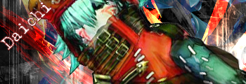
Daichi:Daichi wrote:Okay... the white stands out way to much, crappy plased text, bad font, bad blending...Astra wrote:Adept:
avi: 9/10 i like it, but it's wayyy over used.
sig: 7/10 i liked the concept, and the quality of the stock, but the text is a little plain
a new vector style sig i made, i'm not too proud of the results, but let me know what you all think:
but if the lighting just wern't that intense... (use a colour correction layer, or something)
6/10 (judging after your standards. if it were some other i would give it 7.)
avi: 6/10 - to monochromatic, doesn't flow.
sig: 5/10 - also fairly monochromatic, the best colors for a sig, are drawn from the render you use. bad blending, bad test, and boring background...
Thanks for the crits on mine...like i said, it was just a test, and the white was supposed to be overly intense...i know about the bad test...i've always sucked with text, so that's no new news. on the other hand...i feel it IS correctly blended, the face isn't supposed to fit with the background, because only a few layers of light were supposed to cover her neck. so i disagree with your critique for the blending area, i only partially covered the render with vectors, but it's blended nicely for the style used. i know what you're thinking about it though.
again, thanks for the negative critics, i finally get something lower than a 9 or 10 and a reason why. i'm always looking for the negative comments.
@ whoever rates next------disregard this post and rate Daichi's sig an avi above mine. i didn't make my current sig or avi, so i can't rightfully have the rated.
Sig by Alkaid_Loves_Haseo (my awesome sis!), Avi by me! Thanks!
Click the Sig for all my work.
Click here for Astra's signature tutorials!
Alkaid_loves_Haseo wrote:I hereby adopt you as my brother.
AuraTwilight wrote:Wow, Astra. Pwn.
Re: Avatar And Signature Rating Topic
Astra can't rate Daichi's already did...but I updated my sig and made a alternate version of it.
The two Kiras(negative):

All I did was put more lettering on the old one. Put red words not white and made the lettering weird and blood runny.
The two Kiras(negative):
All I did was put more lettering on the old one. Put red words not white and made the lettering weird and blood runny.

-
Haseo{Terror of Death}

- Protagonist
- Posts: 3682
- Joined: Sun Apr 22, 2007 12:02 am
- Location: "...in the rift between consciousness and unconsciousness of all souls..."
Re: Avatar And Signature Rating Topic
Adept's NU SIGGAH: 8/10
I just made this Avi, I know it's plain, but paint sucks

I just made this Avi, I know it's plain, but paint sucks
No matter how high the wall. No matter how thick. My love surmounts them all. Like a bird. Flying to you. Forever and ever.
Re: Avatar And Signature Rating Topic
New Avi: 8/10 if you used that is awesome I can't use paint that well.
-
Alkaid_loves_Haseo

- Arena Empress

- Posts: 2095
- Joined: Fri May 25, 2007 10:18 pm
- Location: Icolo @Home
Re: Avatar And Signature Rating Topic
Adept:
~Avi: Still, 10/10.
~Sig: 8.5/10. It looks good, but the negative effect is kind of overdone on both sides. Also, the blue text doesn't really go with the other one, but since they're both basically the same thing, same rating.
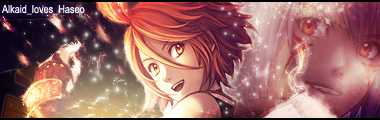
Here's a new avi I made for Itachi:
~Avi: Still, 10/10.
~Sig: 8.5/10. It looks good, but the negative effect is kind of overdone on both sides. Also, the blue text doesn't really go with the other one, but since they're both basically the same thing, same rating.
Here's a new avi I made for Itachi:
*Sig/Avi by Astra(My adopted brother. Haha. =D)*Astra wrote:i hereby adopt you as my sister ^^ best RPer award = my wonderful sis, Alkaid!!
Re: Avatar And Signature Rating Topic
Alkaid_loves_Haseo
Avi: 9/10 awesome
Sig: 9/10 again awesome
Made a new one for my brother he is a KH fan.

Dindn't come out just how I wanted but heck it works for him.
Avi: 9/10 awesome
Sig: 9/10 again awesome
I know just thought I would show what happened.It looks good, but the negative effect is kind of overdone on both sides.
I can't Control the outcome of negative effects on the writing as easily as I can the pic. I just use the normal one cause it looks better to me.Also, the blue text doesn't really go with the other one
Made a new one for my brother he is a KH fan.
Dindn't come out just how I wanted but heck it works for him.

Re: Avatar And Signature Rating Topic

it's a sig i made but it didn't turn out as i wanted it to like the black specs they were kinda unexspected but i thought it turned out pretty well

Sonic gots noughtin on L
Re: Avatar And Signature Rating Topic
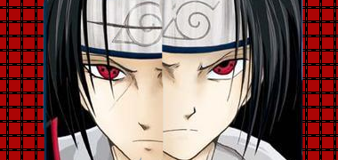
Itachi
Avi: 8/10 its cool
Sig: 4/10 eh kinda don't like it. Black specs throw it off. If you want I can give you one of Itachi I made.
 You can us that if you want.
Avi: 8/10 its cool
Sig: 4/10 eh kinda don't like it. Black specs throw it off. If you want I can give you one of Itachi I made.
Code: Select all
[IMG]http://i241.photobucket.com/albums/ff132/Adept_01/mybanner475c9eb7de3c2zg0.jpg[/IMG]-
Alkaid_loves_Haseo
- Arena Empress
- Posts: 2095
- Joined: Fri May 25, 2007 10:18 pm
- Location: Icolo @Home
Re: Avatar And Signature Rating Topic
Adept: New sig: 6/10 MAJOR blurryness, but it's still cool. Try using a larger copy of the same picture, if you can find one, or simply reduce the size of the overall sig next time, and that should reduce the blurred effect on MyBannerMaker.
New sig I made for a friend offline. She loved it, but I don't like how the overlapping did, even though I had to place it like that in order to make the pictures, since they cut off at the middle weird, but she did. Oh well. Haha.
New sig I made for a friend offline. She loved it, but I don't like how the overlapping did, even though I had to place it like that in order to make the pictures, since they cut off at the middle weird, but she did. Oh well. Haha.
*Sig/Avi by Astra(My adopted brother. Haha. =D)*Astra wrote:i hereby adopt you as my sister ^^ best RPer award = my wonderful sis, Alkaid!!
Re: Avatar And Signature Rating Topic
New sig: 8/10 another hatred pic of those two. LOL
Got a Naruto vs Sasuke sig.

Kinda wanted another one of it but it won't load.
Got a Naruto vs Sasuke sig.
Kinda wanted another one of it but it won't load.
Re: Avatar And Signature Rating Topic
You are good at findig pictures, but youre wasting your potention while using bybannermaker. MyBannerMaker is CRAP...Adept wrote:New sig: 8/10 another hatred pic of those two. LOL
Got a Naruto vs Sasuke sig.
Kinda wanted another one of it but it won't load.
Trust me... when i get to money again, you and A_L_H will get a copy of photoshop (or a REgistration key) with the mail deliverry system... take it as a Xmas gift, okay...
7/10 for good pic.
Re: Avatar And Signature Rating Topic
Yay thank you. But till then I will use what I got...still I like my work with it even though the "mybannermaker" sucks I got around that. Made two new ones just for the hack of it. Didn't come out perfect though...I think I'll get back to editing these sooner or later.Daichi wrote:Trust me... when i get to money again, you and A_L_H will get a copy of photoshop (or a REgistration key) with the mail deliverry system... take it as a Xmas gift, okay...Adept wrote:New sig: 8/10 another hatred pic of those two. LOL
Got a Naruto vs Sasuke sig.
Kinda wanted another one of it but it won't load.


Curse you negative effect! curse you!
Re: Avatar And Signature Rating Topic
Adept: the negative just doesn't look good, but the regular, is great. i suggest you use a program called GIMP, instead of mybannermaker though, then you won't have the annoying "make you own banner at mybannermaker.com" at the bottom.
a new sig i just finished:

a new sig i just finished:
Sig by Alkaid_Loves_Haseo (my awesome sis!), Avi by me! Thanks!
Click the Sig for all my work.
Click here for Astra's signature tutorials!
Alkaid_loves_Haseo wrote:I hereby adopt you as my brother.
AuraTwilight wrote:Wow, Astra. Pwn.

Re: Avatar And Signature Rating Topic
Astra: 7.8/10 Nice colors.
Can someone rate my new avi and sig?
Can someone rate my new avi and sig?

Click teh Sig
oslapedo wrote: Well imo you win for bitchiest forum poster =/
Re: Avatar And Signature Rating Topic
You hit me in my favorite colour palette.Hyuuga wrote:Astra: 7.8/10 Nice colors.
Can someone rate my new avi and sig?
9/10 for it all
-
Mellow Grunty

- Suredeath Hellman
- Posts: 1649
- Joined: Wed Apr 26, 2006 10:22 am
- Location: Sweden
Re: Avatar And Signature Rating Topic
Daichi:
Avatar: 7.5/10 The background looks nice, but the picture of Elk doesn't really stand out much, so it's hard to notice him if you just look at the avatar quickly. The text looks a little plain too.
Signature: 8/10 I dunno what to say, really. Except that the render doesn't really blend in with the background that much, so it looks a little weird. Still looks nice though.
(I know my avatar looks... I dunno, horrible, I'm gonna change it as soon as I get off my lazy ass and decide to change/redo it, but for now I'll just use it. Some good criticism for the sig would be nice too.)
Re: Avatar And Signature Rating Topic
Mellow:
Signature: 10/10 Very excelent. I really like it.
Avatar: 7.5/10 Too many lines, I guess, but the colors are petty nice.
(To anyone going to rate my signate and whatnot: Please don't rate my avatar, for I didn't make it.)
Signature: 10/10 Very excelent. I really like it.
Avatar: 7.5/10 Too many lines, I guess, but the colors are petty nice.
(To anyone going to rate my signate and whatnot: Please don't rate my avatar, for I didn't make it.)

I'M SORRY! SORRY ABOUT BEING A DICK BUT SOMETIMES IT'S HARD TO SUPPRESS THE URGE OF RUINING OTHER PEOPLES LIVES!