
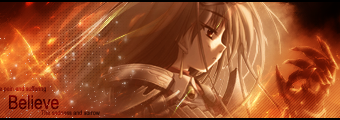
Kyero
Avi: 10/10. Damn, Light with his insane laugh, I LIEK THIS AVI SO MUCH. And the text lol is a plus plus.
Avatar And Signature Rating Topic
Moderator: Moderators
Re: Avatar And Signature Rating Topic

Click teh Sig
oslapedo wrote: Well imo you win for bitchiest forum poster =/

Re: Avatar And Signature Rating Topic
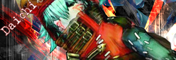
@Daichi: *cough....cough* no rating *cough* (click)
@Hyuuga: avi: 9/10, like the effects saya used. sig: 7/10, i don't like the effects i used on the far right, or far left.
i'd like this one rated please:
@Hyuuga: avi: 9/10, like the effects saya used. sig: 7/10, i don't like the effects i used on the far right, or far left.
i'd like this one rated please:

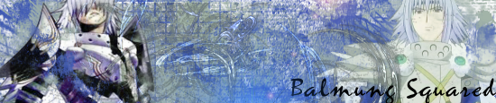
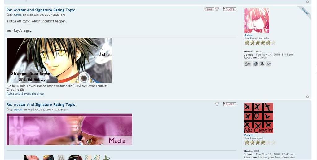
Sig by Alkaid_Loves_Haseo (my awesome sis!), Avi by me! Thanks!
Click the Sig for all my work.
Click here for Astra's signature tutorials!
Alkaid_loves_Haseo wrote:I hereby adopt you as my brother.
AuraTwilight wrote:Wow, Astra. Pwn.
-
Mellow Grunty

- Suredeath Hellman

- Posts: 1649
- Joined: Wed Apr 26, 2006 10:22 am
- Location: Sweden
Re: Avatar And Signature Rating Topic
Astra:
Avatar: 7/10 It looks pretty nice I guess, but the colors are maybe a bit too bright and I have no idea what that... Thing on the bottom of the avatar is. 8D;
Signature in post: 8/10 Really nice effects, and I like the way the girl's hair kind of blends in with the background, but maybe the text is a little too small?
Signature in... Signature: 4/10 Looks like a horrible copy and paste job made in Paint, which it probably is too. Then again, it IS made by E_F_H so it's okay.

Re: Avatar And Signature Rating Topic
don't diss ALH!
but..... because of the diss, you get a minus piont....
9.5/10 for both... i like colours soooooo much...
but..... because of the diss, you get a minus piont....
9.5/10 for both... i like colours soooooo much...
-
Balmung2

- Posts: 410
- Joined: Sat Apr 02, 2005 7:18 pm
- Location: Hiding in a post-it note bush.
- Contact:
Re: Avatar And Signature Rating Topic
Ah, pedobear...
Signature: 6/10 (PB is in a nice position...but the render kinda...what's the word...doesn't look good? Eh)
Avatar: 8/10 (Simple and animated...but that's about it. 8 :p)
Signature: 6/10 (PB is in a nice position...but the render kinda...what's the word...doesn't look good? Eh)
Avatar: 8/10 (Simple and animated...but that's about it. 8 :p)
Re: Avatar And Signature Rating Topic
thanks, balmung-kun.
sig: 8/10. bad colour mix.
avy: 8/10. like the effect, the pixel thing, ya know, but it's missing something...
new sig... yo layzy to change it today...
sig: 8/10. bad colour mix.
avy: 8/10. like the effect, the pixel thing, ya know, but it's missing something...
new sig... yo layzy to change it today...
-
Alkaid_loves_Haseo

- Arena Empress
- Posts: 2095
- Joined: Fri May 25, 2007 10:18 pm
- Location: Icolo @Home
Re: Avatar And Signature Rating Topic
Thanks for the tough rating, but I actually made it in GIMP, and that's not a girl...That's Train Heartnet from the anime Blackcat. I just started making sigs, with Astra and Daichi 's help, so it may not be as great as some others, but again, thanks for the tough rating. No hard feelings, though. Your rating's just an opinion and it's going to make me want to get better at making sigs. Oh, and please call me Alkaid. Thanks. ^-^Mellow Grunty wrote:Signature in... Signature: 4/10 Looks like a horrible copy and paste job made in Paint, which it probably is too. Then again, it IS made by E_F_H so it's okay.
((Thanks for standing up for me, by the way. It's okay, though, since tough critism leads to better products, right? Everyone has to be told their bad things as well as their good ones. This just happens to be a time when someone didn't like one of mine, which is making me want to practice more and get better. ^-^))Daichi wrote:new sig... yo layzy to change it today...
Haha. Funny sig, Daichi. I like the background colors and how they flow together. I'd say a....9.5/10. Minus .5 for the lack of activity within the sig itself and the semi-plain style of text.
*Sig/Avi by Astra(My adopted brother. Haha. =D)*Astra wrote:i hereby adopt you as my sister ^^ best RPer award = my wonderful sis, Alkaid!!
Re: Avatar And Signature Rating Topic
well, thanks... gonna edit it...Alkaid_loves_Haseo wrote:Thanks for the tough rating, but I actually made it in GIMP, and that's not a girl...That's Train Heartnet from the anime Blackcat. I just started making sigs, with Astra and Daichi 's help, so it may not be as great as some others, but again, thanks for the tough rating. No hard feelings, though. Your rating's just an opinion and it's going to make me want to get better at making sigs. Oh, and please call me Alkaid. Thanks. ^-^Mellow Grunty wrote:Signature in... Signature: 4/10 Looks like a horrible copy and paste job made in Paint, which it probably is too. Then again, it IS made by E_F_H so it's okay.
((Thanks for standing up for me, by the way. It's okay, though, since tough critism leads to better products, right? Everyone has to be told their bad things as well as their good ones. This just happens to be a time when someone didn't like one of mine, which is making me want to practice more and get better. ^-^))Daichi wrote:new sig... yo layzy to change it today...
Haha. Funny sig, Daichi. I like the background colors and how they flow together. I'd say a....9.5/10. Minus .5 for the lack of activity within the sig itself and the semi-plain style of text.
btw... have ya tried to make a sig with that tut i gave you?
-
-Loveless-

- Posts: 773
- Joined: Sat Nov 11, 2006 4:25 pm
- Location: In Atoli's boobage. : D
- Contact:
Re: Avatar And Signature Rating Topic
I dunno who to rate, so I'll do both.
Alkaid_loves_Haseo:
Avatar: 9/10 nice but it looks a little..Lazy? I think that's the word.
Sig: 9.5/10 Nice BG and placement of pic, but the text is semi hard to see.
and Dachi's
Lol. I like it.
Ava: 8/10 Gifs are nice, but I never understood why use them as Avatars.
Sig: 9.5 I like the Placement of Picture and words.
Well, 1st rating hope I did okk.

-
Kyero Fox

- Pilot of White Glint
- Posts: 2169
- Joined: Tue May 01, 2007 6:30 pm
- Location: Some where Inside AIDA<Aldous>
Re: Avatar And Signature Rating Topic
You already know what I think of your avatar and sig Loveless ;P
anyone like my new avatar?
oh and my new sig gif
anyone like my new avatar?
oh and my new sig gif

-
Alkaid_loves_Haseo
- Arena Empress
- Posts: 2095
- Joined: Fri May 25, 2007 10:18 pm
- Location: Icolo @Home
Re: Avatar And Signature Rating Topic
Kyero:
------------
Avi: 9/10-It's a good pic and a good avi, and the border matches well.
GIP: 8.5/10-It's interesting and funny, but the scene is kind of dull.
Will someone please rate the new sig I made for Haseo{Terror of Death}? ^-^

------------
Avi: 9/10-It's a good pic and a good avi, and the border matches well.
GIP: 8.5/10-It's interesting and funny, but the scene is kind of dull.
Will someone please rate the new sig I made for Haseo{Terror of Death}? ^-^
*Sig/Avi by Astra(My adopted brother. Haha. =D)*Astra wrote:i hereby adopt you as my sister ^^ best RPer award = my wonderful sis, Alkaid!!
Re: Avatar And Signature Rating Topic
ok, i'm rating every one who posted on this page...once....(slightly harsh ratings)
Mellow:
sig: 5/10 - although it's nice, it mainly looks like a render slapped on a monochromatic background. there's too much text, and the 'pixel' text doesn't fit...at all. also the name, on the sidg is way to big, it takes away from the main focal. you need blending for the render. There's good depth but the background has a pixelated effect to it. there's no real flow, to the sig, the render is too big for the dimensions, and the flow of the background doesn't match the flow of the render.
avi: 6/10 - i like the placement of the render, and the fact that you can only see a certain part, but again, there's no real blending, and not much interest, no real flow, but good depth.
Daichi:
sig (current): 3/10 - the text is WAY too big, and takes too much from the render, which is poorly positioned in the corner...terrible positioning. better placement would be more towards the center of the sig. i hate the fact that the effects cover part of the main focal's face. the depth is terrible because it covers the face, and there's absolutely no flow whatsoever. probably one of the worst i've seen in awhile from you Daichi.
sig: 4/10 - same as above, except the render is slightly more visible.
avi: 4/10 - too small, kind of boring, doesn't attract attention.
Balmung2
sig: 5/10 - aside from having no flow, the C4D? in the background isn't blended correctly to go with the sig. Both the focals of the sig are poorly place, i recommend the center, which in your sig, is just boring blank space. i don't like the messy 'fractal' look to it, with the random lower-opacity C4D stuck in there. Although Balmung is blended, i feel not enough.
avi: 6/10 - the checkered effect looks interesting, but like Daichi's it's a tad boring, and doesn't attract too much attention.
A_L_H
i can't rate, because i made them.
-Loveless-
sig: 7/10 - i'd rather not rate this one because it's Tsugasa's and you didn't give credit for his work. i'm always apposed to the 'no credit' fact. it's stealing in my opinion. but i'll rate it for Tsugasa. although the focal is nicely place...you can't see it very well, i realize it's not a good quality image, because i've attempted a sig with the same one, i didn't take points off for that. but i think there's too many effects for the real point of the sig, too much text, which takes away from the focal.
avi: 4/10 - never really liked it, looks like it was made in paint in like 10 minutes or so, i have to give it to you that it's pretty good for paint, but still fairly borings, and different.
Kyero Fox
sig (left): 7/10 - i lol'd at your 'get the **** out' sig and it's an interesting animation. the quality is decent, but the loop seems off to me, i don't know why.
sig (right): 6/10 - i don't really get it, what's it for? the stats are interesting, and it was fun to read the first time, but i seems random.
avi: 7/10 - i give you a lot of points for the high quality image, but i minus three for the fact that it's just an image resized.
------------------------------------------------------------------------------------------------------
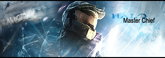
now that that's all said and done, i'd like this Halo 3 sig rated...rate it harsh as you'd like. tear it apart of you want, i'm looking for a good rating.
Mellow:
sig: 5/10 - although it's nice, it mainly looks like a render slapped on a monochromatic background. there's too much text, and the 'pixel' text doesn't fit...at all. also the name, on the sidg is way to big, it takes away from the main focal. you need blending for the render. There's good depth but the background has a pixelated effect to it. there's no real flow, to the sig, the render is too big for the dimensions, and the flow of the background doesn't match the flow of the render.
avi: 6/10 - i like the placement of the render, and the fact that you can only see a certain part, but again, there's no real blending, and not much interest, no real flow, but good depth.
Daichi:
sig (current): 3/10 - the text is WAY too big, and takes too much from the render, which is poorly positioned in the corner...terrible positioning. better placement would be more towards the center of the sig. i hate the fact that the effects cover part of the main focal's face. the depth is terrible because it covers the face, and there's absolutely no flow whatsoever. probably one of the worst i've seen in awhile from you Daichi.
sig: 4/10 - same as above, except the render is slightly more visible.
avi: 4/10 - too small, kind of boring, doesn't attract attention.
Balmung2
sig: 5/10 - aside from having no flow, the C4D? in the background isn't blended correctly to go with the sig. Both the focals of the sig are poorly place, i recommend the center, which in your sig, is just boring blank space. i don't like the messy 'fractal' look to it, with the random lower-opacity C4D stuck in there. Although Balmung is blended, i feel not enough.
avi: 6/10 - the checkered effect looks interesting, but like Daichi's it's a tad boring, and doesn't attract too much attention.
A_L_H
i can't rate, because i made them.
-Loveless-
sig: 7/10 - i'd rather not rate this one because it's Tsugasa's and you didn't give credit for his work. i'm always apposed to the 'no credit' fact. it's stealing in my opinion. but i'll rate it for Tsugasa. although the focal is nicely place...you can't see it very well, i realize it's not a good quality image, because i've attempted a sig with the same one, i didn't take points off for that. but i think there's too many effects for the real point of the sig, too much text, which takes away from the focal.
avi: 4/10 - never really liked it, looks like it was made in paint in like 10 minutes or so, i have to give it to you that it's pretty good for paint, but still fairly borings, and different.
Kyero Fox
sig (left): 7/10 - i lol'd at your 'get the **** out' sig and it's an interesting animation. the quality is decent, but the loop seems off to me, i don't know why.
sig (right): 6/10 - i don't really get it, what's it for? the stats are interesting, and it was fun to read the first time, but i seems random.
avi: 7/10 - i give you a lot of points for the high quality image, but i minus three for the fact that it's just an image resized.
------------------------------------------------------------------------------------------------------
now that that's all said and done, i'd like this Halo 3 sig rated...rate it harsh as you'd like. tear it apart of you want, i'm looking for a good rating.
Sig by Alkaid_Loves_Haseo (my awesome sis!), Avi by me! Thanks!
Click the Sig for all my work.
Click here for Astra's signature tutorials!
Alkaid_loves_Haseo wrote:I hereby adopt you as my brother.
AuraTwilight wrote:Wow, Astra. Pwn.
-
Mellow Grunty
- Suredeath Hellman
- Posts: 1649
- Joined: Wed Apr 26, 2006 10:22 am
- Location: Sweden
Re: Avatar And Signature Rating Topic
Saying that just makes it look worse, that sig would've actually BEEN good if it was made in paint. But if it's made in any other, SUPERIOR program it's just horrible.Alkaid_loves_Haseo wrote:Thanks for the tough rating, but I actually made it in GIMP
Read my post again. Good, now read it carefully. Did I ever mention anything about the character in the signature?Alkaid_loves_Haseo wrote:and that's not a girl...That's Train Heartnet from the anime Blackcat.
No u.Alkaid_loves_Haseo wrote:Oh, and please call me Alkaid. Thanks. ^-^
Disregard this post and rate Astra's avvy and shiggies instead.
Re: Avatar And Signature Rating Topic
this one AT turned down... dunno why...

My first C4D based sigs:


nex one... don't say "bad spelling"...

EDIT: Jezz... this time i forgot my wonderful teacher'ssig.......
100000000000000000...0000000..00................000 out of 10.
this PWWWWWWWWWNS, and wel balanced colour scheeme
My first C4D based sigs:
nex one... don't say "bad spelling"...
EDIT: Jezz... this time i forgot my wonderful teacher'ssig.......
100000000000000000...0000000..00................000 out of 10.
this PWWWWWWWWWNS, and wel balanced colour scheeme
-
Mellow Grunty
- Suredeath Hellman
- Posts: 1649
- Joined: Wed Apr 26, 2006 10:22 am
- Location: Sweden
Re: Avatar And Signature Rating Topic
Riet.
AT sig: The background looks nice, I guess. But the font is really generic, that white box below the text just looks silly and Aura doesn't really blend in with the background enough. Also, I have no idea wtf kind of effect you wanted with those black lines on the far right and bottom, but it just looks silly. Could need a border. 6.5/10
Tenrawr sig: This one's almost the total opposite, it's got that same lines on the edges of the sig and that silly box below the text is still there. This time though, Tenrawr blends in TOO much with the background and it looks like he's almost part of it. Could need a border too. 7/10, plus points for Tenrawr and the pink.
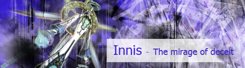
Innis sig: Now this one's better, the background looks really nice and Innis blends in very nicely, that annoying white box is still there but otherwise... Everything looks good, just needs some kind of border. 8.5/10, this one's my favorite
Haseo Xth sig: This one's good, the background looks pretty simple and the font is a little too... Boring, otherwise it looks pretty good, once again needs a border. 7.5/10
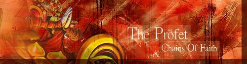
Fidchell sig: This one would've been my favorite, if not for the misspelling of "prophet" (:P) and that silly "shadow" at the edges... Oh, now I get it, you're trying to give the sig some kind of "button" effect? Then you should put one highlights on the opposing edges too, to make it a little more clear. And... You guessed it, needs a border. 8/10
Haseo Xht sig: This one's pretty much the same as the last Xth sig, except it has that annoying white box and attempt to button-effect. The typo is a little annoying, but otherwise the background looks really nice. 7/10
Avatar: Eww pedobear. 0/10
Signature: Eww pedobear, looks way too simple too. 0/10
AT sig: The background looks nice, I guess. But the font is really generic, that white box below the text just looks silly and Aura doesn't really blend in with the background enough. Also, I have no idea wtf kind of effect you wanted with those black lines on the far right and bottom, but it just looks silly. Could need a border. 6.5/10
Tenrawr sig: This one's almost the total opposite, it's got that same lines on the edges of the sig and that silly box below the text is still there. This time though, Tenrawr blends in TOO much with the background and it looks like he's almost part of it. Could need a border too. 7/10, plus points for Tenrawr and the pink.
Innis sig: Now this one's better, the background looks really nice and Innis blends in very nicely, that annoying white box is still there but otherwise... Everything looks good, just needs some kind of border. 8.5/10, this one's my favorite
Haseo Xth sig: This one's good, the background looks pretty simple and the font is a little too... Boring, otherwise it looks pretty good, once again needs a border. 7.5/10
Fidchell sig: This one would've been my favorite, if not for the misspelling of "prophet" (:P) and that silly "shadow" at the edges... Oh, now I get it, you're trying to give the sig some kind of "button" effect? Then you should put one highlights on the opposing edges too, to make it a little more clear. And... You guessed it, needs a border. 8/10
Haseo Xht sig: This one's pretty much the same as the last Xth sig, except it has that annoying white box and attempt to button-effect. The typo is a little annoying, but otherwise the background looks really nice. 7/10
Avatar: Eww pedobear. 0/10
Signature: Eww pedobear, looks way too simple too. 0/10
-
Haseo{Terror of Death}

- Protagonist
- Posts: 3682
- Joined: Sun Apr 22, 2007 12:02 am
- Location: "...in the rift between consciousness and unconsciousness of all souls..."
Re: Avatar And Signature Rating Topic
Avi: 4/10: It is unappealing to my eyes... sorry(?)
Sigg: 7/10: Its creepy, I LIKE CREEPY
No matter how high the wall. No matter how thick. My love surmounts them all. Like a bird. Flying to you. Forever and ever.
Re: Avatar And Signature Rating Topic
your avy is... kite..... if it were coloured, it would have a 10/10.... but in greyscales: 8/10
sig: l'll like more then yellow boxes as a background, but the picture and the font is soooo good...
8/10
sig: l'll like more then yellow boxes as a background, but the picture and the font is soooo good...
8/10
Re: Avatar And Signature Rating Topic
@Daichi: if you made those two, you are improving from the crappy bear sig you were using earlier.
sig: all those effects are nice, but they take too much from the render. lower the opacity on all the background layer, or attract more attention to the focal. the text is wayyyy too f*ing big...MAKE IT SMALLER! all the text you do is too over sized!! it takes all the attention away from the focal and adds it to your bad choice of text. NO. try some clipping masks. 8/10 not bad though.
avi: 8/10 i like the effects, but RESIZE THE TEXT!!! WAY TO BIG! notice all my text is small. you don't want all your attention attracted to the text instead of the render...
this might help.
don't look at your sig for about 5 or 10 minutes...walk around the room...look at something else. then look straight at your sig and what do your eyes go to first? the render? the chaotic background? or the text? the chaotic background and the text. that's not what you want.
-----------------------------------------------
my newest one, i tried out a new style, and tested out the pen tool is greater depth. i'm fairly impressed with the results. and i would like it rated. i'd prefer to have something less than a 10/10, and i would like lots of negative feedback for improvement.
yes...i know the text SUCKS. i'm working on that.
Sig by Alkaid_Loves_Haseo (my awesome sis!), Avi by me! Thanks!
Click the Sig for all my work.
Click here for Astra's signature tutorials!
Alkaid_loves_Haseo wrote:I hereby adopt you as my brother.
AuraTwilight wrote:Wow, Astra. Pwn.
Re: Avatar And Signature Rating Topic
thanks for the tips....
im only playing arround with styles, so let me know ANY mistake, or flaw in my sigs...
p.s. the Pedobear were made in GIMP, cuz my laptop somehow chrashed it's BIOS... i know, my pc hates me...
can't you send me some text tuts for me, my dear Astra-Sensei? i Want to know how to make a perfect sig.
(starting at a graphical hi-scool next year, prehaps)
your text here is too small, and is crappy, as you said.
the background C4D is good(if it's a C4D)
I like the experimental effects, colour flow and so on...
10/10
and i made the elk sig
-
-Loveless-
- Posts: 773
- Joined: Sat Nov 11, 2006 4:25 pm
- Location: In Atoli's boobage. : D
- Contact:
Re: Avatar And Signature Rating Topic
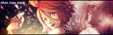
Avatar: 8/10 I <3 the colors
Signature: 8.5/10 I like How you faded the pictures around the edges.
Signature: 8.5/10 I like How you faded the pictures around the edges.