Nah the quote wasn't meant to be serious LOL! I just thought of it a long time ago and I thought it sounded cool. So yeah oh well... xD
avatar: 9/10 it is funny and of good quality
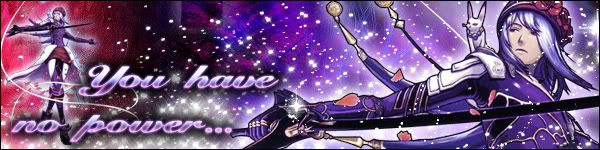
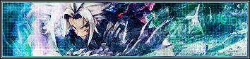
sig: 5/10 for your sig since it is not in banner format but just as a randomly sized pic.
Avatar And Signature Rating Topic
Moderator: Moderators
-
Cruel Ruin

- Posts: 141
- Joined: Wed May 18, 2005 9:11 pm
- Location: Angel's Sanctuary
- Contact:
Last edited by Cruel Ruin on Tue Jul 04, 2006 6:29 pm, edited 1 time in total.
 Vist Aku's and my anime blog

-
marthwmaster

- The Fullglass Optimist

- Posts: 1405
- Joined: Wed Apr 12, 2006 4:29 pm
- Location: to the east of west
-
Christopher

- Posts: 14
- Joined: Tue May 02, 2006 12:43 am
For Kite 2000, I like the sig, 8.5/10. The generic yellow glow on the 'I am the Aida Tri edge' however, is the bit that doesn't look too flash.
These are all the .hack sets I have (that are good), made by me or friends.

 - Friend

 - Friend
 - Me
- Me

 - Me
- Me
As you can see, my friends are somewhat better at this...
These are all the .hack sets I have (that are good), made by me or friends.
- Friend - Friend - Me - MeAs you can see, my friends are somewhat better at this...

-
Phantazy

- Posts: 41
- Joined: Thu Oct 06, 2005 7:05 pm
- Location: Somewhere, avoiding reality(Oh, fine, Michigan)
- Contact:
Red Haseo Ava: 6.5. I don't think the text is necessary and it doesn't look like all that much effort was put into it.
Red Haseo Banner: 9. Simple, but looks very good.
Root Town Ava: 8. Looks good, but again I dont think the text is necessary.
Root Town Banner: Hm.... tough one. I say 7.5 because I really like the effect over the background, but the text doesn't mesh with it well. And the "Enter the World" in the corner doesn't seem to fit very well... it should've been worked into the banner more somehow, IMO
Skeith Ava: 8.5. If you haven't figured it out yet, I don't like it when people put their names on their avatars, but since it's small, I can let it go... >.>
Skeith Sig: 6.5. The object in the foreground's colors and the background colors clash.... a lot. >_O
Haseo Ava: 8. You should know why by now. Sorry, it's just a weird pet peeve of mine. ^_^;
Haseo Sig: 9.5. Awesomeness! The only think I can say is that you might want to lose the reflection of Haseo's face. Also, the text is a little hard to read...
Current Ava/Sig: Ava is 9, Sig gets a 7 because the colors and background seem a bit....jarring somehow and the text is hard to read again. Although it deserves an automatic 10 just for being TsukasaXSubaru *biased* >.>

-
Christopher
- Posts: 14
- Joined: Tue May 02, 2006 12:43 am
Since I never just use a screenshot or unedited stock images, names are needed to stop people from running off with the image. If they do, you then might be able to tell by weirdly cropped avatars or large blurry spots. Oh, and for the last one you are complaining you can't read the text? 
I like bright images. My personal favourites out of those four would be the four avatar and second sig.
For you...the avatar is just screenshot, but the sig is nice. Griding overtop of the altmit thingie whatsit looks quite good. The blurry Mistral isn't too hot, maybe the griding here is doing it. And the sig is huge. I somehow doubt there would be any game mistral images of her reclining...
8/10
-
Cruel Ruin
- Posts: 141
- Joined: Wed May 18, 2005 9:11 pm
- Location: Angel's Sanctuary
- Contact:
-
Christopher
- Posts: 14
- Joined: Tue May 02, 2006 12:43 am
To me it looks better as the inverted version as opposed to the normal blue one XD. I find that it looks more hellish with the orange. Haseo almost seems to be clawing his way out of the set in the inverted vesions while I struggle to get the same effect in the normal.
Essentially The World as we observe it has a terrible habit of always being screwed, and so inverted colours don't strike me as out of place.
I can't get it perfect...The top one is my latest, it has tiny 0's and 1's in a pattern across the background.
 - 0101 on left, base on right. Green grid style.
 - Blue grid styles
 - base styles.

 - original pieces
Essentially The World as we observe it has a terrible habit of always being screwed, and so inverted colours don't strike me as out of place.
I can't get it perfect...The top one is my latest, it has tiny 0's and 1's in a pattern across the background.
- 0101 on left, base on right. Green grid style. - Blue grid styles - base styles. - original pieces-
Cruel Ruin
- Posts: 141
- Joined: Wed May 18, 2005 9:11 pm
- Location: Angel's Sanctuary
- Contact:
-
Cruel Ruin
- Posts: 141
- Joined: Wed May 18, 2005 9:11 pm
- Location: Angel's Sanctuary
- Contact:
-
marthwmaster
- The Fullglass Optimist
- Posts: 1405
- Joined: Wed Apr 12, 2006 4:29 pm
- Location: to the east of west
-
Cellos-CBK

- Posts: 123
- Joined: Sun Oct 02, 2005 4:42 pm
- Location: Hunting, one PK at a time
- Contact:


-
marthwmaster
- The Fullglass Optimist
- Posts: 1405
- Joined: Wed Apr 12, 2006 4:29 pm
- Location: to the east of west