
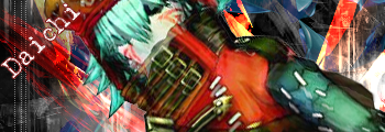
well... some one overstreched zero so it dosen't look too great. and the flash should be covered a more. (use a red, colour burn brush to cover)
co..... so.... 6/10
Avatar And Signature Rating Topic
Moderator: Moderators

Re: Avatar And Signature Rating Topic
my suggestions...first of all, i'm not going to rate it because i want to critique it:LegendaryDarkKnight wrote:Someone rate my MMZ sig please.
1) the render it stretched and should be flattened a tad more.
2) it's not blended at all, it looks like to made a background and just slapped the render in between to brushed layers.
3) there's no depth
4) the flow is off
5) there's no really lighting
how to fix these things...
1) just move the render close together to make it look less stretched, hold down 'shift' while doing this to preserve the quality.
2) try messing around with the render a little more...such as making a bunch of copies of it, then motion blur some at about 20-40 using the same motion as the flow of your sig...(i'll get to flow in a second) then with the top render layers, use a small eraser tool with an opacity around 30% and lightly (which soft grunge or could brushes) brush around the render.
3) try blurring the background with the blur tool, or maybe just a little around your render, and try applying the image, and sharpening it a bit, then go edit > fade sharpen and lower it to 50%.
4) Zero is moving in a different direction that you have the background moving...when you add your brushes...try the move tool, and press ctrl + T and move your brush strokes around a little...to get it to match the motion Zero is moving....this can get tedious after the 20th layers or so, but it's makes it look a lot better...
and
5) the hand with the light touching the sword is not blended at all first of all...but you don't really want that to be your light source...so just darken that and blend it a bit more. now for lighting...find a good place for a light source...i usually do it behind my render, or behind and to the side a little...then take out some soft grunge or soft cloud brushes using white, just brush in a light source...set that layer to soft light, or lighten, whichever looks better.
Daichi: your sig is pretty dark, it needs some light or a light source...i recommend adjustment layers, just play around with those for while. 7/10

Sig by Alkaid_Loves_Haseo (my awesome sis!), Avi by me! Thanks!
Click the Sig for all my work.
Click here for Astra's signature tutorials!
Alkaid_loves_Haseo wrote:I hereby adopt you as my brother.
AuraTwilight wrote:Wow, Astra. Pwn.
Re: Avatar And Signature Rating Topic
hey.... I ment it to be dark. he is hiding in the shadows....Daichi: your sig is pretty dark, it needs some light or a light source...i recommend adjustment layers, just play around with those for while. 7/10
btw... your sig is not working. use multiplephotobucket accounts to avoid that.
-
LegendaryDarkKnight

- Mediocre Madness

- Posts: 1607
- Joined: Sat Nov 25, 2006 1:18 pm
- Location: Here and there.
Re: Avatar And Signature Rating Topic
Thank you for the advice. It helped out a lot.Astra wrote:my suggestions...first of all, i'm not going to rate it because i want to critique it:LegendaryDarkKnight wrote:Someone rate my MMZ sig please.
1) the render it stretched and should be flattened a tad more.
2) it's not blended at all, it looks like to made a background and just slapped the render in between to brushed layers.
3) there's no depth
4) the flow is off
5) there's no really lighting
how to fix these things...
1) just move the render close together to make it look less stretched, hold down 'shift' while doing this to preserve the quality.
2) try messing around with the render a little more...such as making a bunch of copies of it, then motion blur some at about 20-40 using the same motion as the flow of your sig...(i'll get to flow in a second) then with the top render layers, use a small eraser tool with an opacity around 30% and lightly (which soft grunge or could brushes) brush around the render.
3) try blurring the background with the blur tool, or maybe just a little around your render, and try applying the image, and sharpening it a bit, then go edit > fade sharpen and lower it to 50%.
4) Zero is moving in a different direction that you have the background moving...when you add your brushes...try the move tool, and press ctrl + T and move your brush strokes around a little...to get it to match the motion Zero is moving....this can get tedious after the 20th layers or so, but it's makes it look a lot better...
and
5) the hand with the light touching the sword is not blended at all first of all...but you don't really want that to be your light source...so just darken that and blend it a bit more. now for lighting...find a good place for a light source...i usually do it behind my render, or behind and to the side a little...then take out some soft grunge or soft cloud brushes using white, just brush in a light source...set that layer to soft light, or lighten, whichever looks better.
Daichi: your sig is pretty dark, it needs some light or a light source...i recommend adjustment layers, just play around with those for while. 7/10
Anyways I made a new Nero sig. By refrencing a tut I found and with Asta's advice.
Astra: I don't know if you care but heres a good tut site. http://psprofessor.orgfree.com/index.html
Also you can find a lot of good renders and c4d's here: http://planetrenders.net/
Ok can someone rate my new Nero sig?
Sig by me.
Re: Avatar And Signature Rating Topic
You're welcome...for reference though...i give Saya credit for teaching me most of that stuff...
anyways...i've never seen that site before.
yeah...i depend on C4Ds...but for my renders, i use animerender.com. i used to use planetrender.com, but scrolled through every page and got all the render i needed, then moved on to another site XD
your sig- 9/10
the render is blended because the background color matches the render...try a gradient map or two, then lower the opacity, and set that layer to 'color' the lighting is pretty good, and the depth is good. the flow is decent...if it was my sig, i'd move the text to the lower left, but the text style matches, and fits nicely with the sig.
i have a new one today testing out a new style. can some one rate it please?
Sig by Alkaid_Loves_Haseo (my awesome sis!), Avi by me! Thanks!
Click the Sig for all my work.
Click here for Astra's signature tutorials!
Alkaid_loves_Haseo wrote:I hereby adopt you as my brother.
AuraTwilight wrote:Wow, Astra. Pwn.
-
azureeagle

- Ride on Shooting Star

- Posts: 1140
- Joined: Fri Jun 08, 2007 9:10 pm
Re: Avatar And Signature Rating Topic
I love the sig, I liked how you made the background seem if winds were blowing leaves around.
Sig: 9/10
Can someone rate my Avi and Sig( I made them My Self.)
Sig: 9/10
Can someone rate my Avi and Sig( I made them My Self.)
Uchuuu, kitaaa!!!
Re: Avatar And Signature Rating Topic
you have cut two low-res pictures together, and choosen a REALY bad font colour. the awy is grainy, and looks motion-brured.
so 3/10 for BOTH
so 3/10 for BOTH

Re: Avatar And Signature Rating Topic
Sig - 4/10
Uh, you just pu two pics together
Avi - 5/10
Well, i'm kinda like it, but the font makes it looks bad :<
Can anybody rate my new Avi and Sig?
Uh, you just pu two pics together
Avi - 5/10
Well, i'm kinda like it, but the font makes it looks bad :<
Can anybody rate my new Avi and Sig?

Click teh Sig
oslapedo wrote: Well imo you win for bitchiest forum poster =/
Re: Avatar And Signature Rating Topic
tyanks for not rating me....Hyuuga wrote:Sig - 4/10
Uh, you just pu two pics together
Avi - 5/10
Well, i'm kinda like it, but the font makes it looks bad :<
Can anybody rate my new Avi and Sig?
10/10. like the blood
-
sunahisoka

- Posts: 122
- Joined: Sun Sep 09, 2007 12:38 pm
- Location: <3 Somewhere untouchable.~
Re: Avatar And Signature Rating Topic
Mm, how about mine?~ The Siggy is like a 1.
@_@ I didn't do much, kinda got lazy.
But my avatar I did work hard on.
@_@ I didn't do much, kinda got lazy.
But my avatar I did work hard on.

Re: Avatar And Signature Rating Topic
looks cool.. but how about readin' the first post. first rate the above, and then ask..sunahisoka wrote:Mm, how about mine?~ The Siggy is like a 1.
@_@ I didn't do much, kinda got lazy.
But my avatar I did work hard on.
9/10 for sig
8/10 for avy
-
sunahisoka
- Posts: 122
- Joined: Sun Sep 09, 2007 12:38 pm
- Location: <3 Somewhere untouchable.~
Re: Avatar And Signature Rating Topic
Oops, sorry. Okay.
Daichi: Avatar:7/10
Signature:9/10
<3 I really like the colors they seem to blend in very well, on the signature. n.n Good work~
Daichi: Avatar:7/10
Signature:9/10
<3 I really like the colors they seem to blend in very well, on the signature. n.n Good work~
Re: Avatar And Signature Rating Topic
i like your freshy colours. and i am only good, cuz Astra has taken me under his digital wings...sunahisoka wrote:Oops, sorry. Okay.
Daichi: Avatar:7/10
Signature:9/10
<3 I really like the colors they seem to blend in very well, on the signature. n.n Good work~
-
sunahisoka
- Posts: 122
- Joined: Sun Sep 09, 2007 12:38 pm
- Location: <3 Somewhere untouchable.~
Re: Avatar And Signature Rating Topic
That's a good thing. =D People like that are the best.~

Re: Avatar And Signature Rating Topic
kay so this is my Avatar on TPL, another awesome forum of mine. Tell me what you think. Its Made with The GImp, on Windows 2000 and an underlighted Monitor. If I still had my awesome $1,0000 pc I could do a lot better job, but for now on this really old machine this is the best it can spit out. Any response is much apreciated and MAybe some pointers too?

GUILTY DRAGON // PC: BeeTea // Lvl: 65 Member Address: 807 162 367
Weapon Power: 1100 // 1500 //1100 //16% DEF
Deck ATK PWR: 11786 // 11364 // 11247 //11074
Re: Avatar And Signature Rating Topic
5/10 slow, laggy...and WAY over contrasted.
sig: 8/10...random imaged put together...
avi: 10/10 very, very good....i really like your avi.
new sig i'd like rating:
i realize the top of the head isn't blended good enough...
sig: 8/10...random imaged put together...
avi: 10/10 very, very good....i really like your avi.
new sig i'd like rating:
i realize the top of the head isn't blended good enough...
Sig by Alkaid_Loves_Haseo (my awesome sis!), Avi by me! Thanks!
Click the Sig for all my work.
Click here for Astra's signature tutorials!
Alkaid_loves_Haseo wrote:I hereby adopt you as my brother.
AuraTwilight wrote:Wow, Astra. Pwn.
Re: Avatar And Signature Rating Topic
mmm to be honest, you render isn't really too blended in to the siggy....

someone rate mine
someone rate mine
-
Kyero Fox

- Pilot of White Glint
- Posts: 2169
- Joined: Tue May 01, 2007 6:30 pm
- Location: Some where Inside AIDA<Aldous>
Re: Avatar And Signature Rating Topic
Wow that one is really nice. coulda added a bit more tho  I give it a 9/10 would be a perfect 10 if there was atleast one mroe pic of AK in it.
rate mine plz!
rate mine plz!

Re: Avatar And Signature Rating Topic
the quote is awesome and the background is interesting, not boring at all !
id say 8/10
id say 8/10
Re: Avatar And Signature Rating Topic
Astra wrote:i realize the top of the head isn't blended good enough...
Thanks captain obvious...*sarcasm*Revo wrote:mmm to be honest, you render isn't really too blended in to the siggy....
you're sig...the render is small, but the right side of the sig is more interesting than the left side of the sig...which is quite empty and boring... 8/10
Sig by Alkaid_Loves_Haseo (my awesome sis!), Avi by me! Thanks!
Click the Sig for all my work.
Click here for Astra's signature tutorials!
Alkaid_loves_Haseo wrote:I hereby adopt you as my brother.
AuraTwilight wrote:Wow, Astra. Pwn.