Page 2 of 65
Posted: Mon Jul 03, 2006 1:04 pm
by Cruel Ruin
Nah the quote wasn't meant to be serious LOL! I just thought of it a long time ago and I thought it sounded cool. So yeah oh well... xD
avatar: 9/10 it is funny and of good quality
sig: 5/10 for your sig since it is not in banner format but just as a randomly sized pic.
Posted: Mon Jul 03, 2006 6:06 pm
by Kite_2000
Posted: Tue Jul 04, 2006 1:52 pm
by marthwmaster
Good suggestion, Cruel Ruin. I think I'll see if I can ask the person who made the sig for me to...make it flashier.
Posted: Wed Jul 05, 2006 11:37 pm
by Christopher
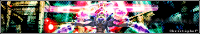
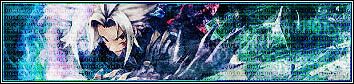
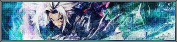
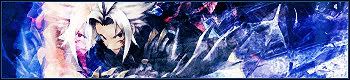
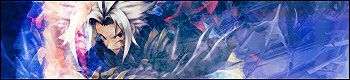
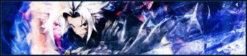
For Kite 2000, I like the sig, 8.5/10. The generic yellow glow on the 'I am the Aida Tri edge' however, is the bit that doesn't look too flash.
These are all the .hack sets I have (that are good), made by me or friends.


- Friend

- Friend
- Me

- Me
As you can see, my friends are somewhat better at this...
Posted: Thu Jul 06, 2006 1:16 am
by Phantazy
Red Haseo Ava: 6.5. I don't think the text is necessary and it doesn't look like all that much effort was put into it.
Red Haseo Banner: 9. Simple, but looks very good.
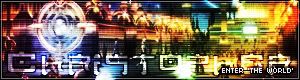
Root Town Ava: 8. Looks good, but again I dont think the text is necessary.
Root Town Banner: Hm.... tough one. I say 7.5 because I really like the effect over the background, but the text doesn't mesh with it well. And the "Enter the World" in the corner doesn't seem to fit very well... it should've been worked into the banner more somehow, IMO
Skeith Ava: 8.5. If you haven't figured it out yet, I don't like it when people put their names on their avatars, but since it's small, I can let it go... >.>
Skeith Sig: 6.5. The object in the foreground's colors and the background colors clash.... a lot. >_O
Haseo Ava: 8. You should know why by now. Sorry, it's just a weird pet peeve of mine. ^_^;
Haseo Sig: 9.5. Awesomeness! The only think I can say is that you might want to lose the reflection of Haseo's face. Also, the text is a little hard to read...
Current Ava/Sig: Ava is 9, Sig gets a 7 because the colors and background seem a bit....jarring somehow and the text is hard to read again. Although it deserves an automatic 10 just for being TsukasaXSubaru *biased* >.>
Posted: Thu Jul 06, 2006 4:00 am
by Christopher
Since I never just use a screenshot or unedited stock images, names are needed to stop people from running off with the image. If they do, you then might be able to tell by weirdly cropped avatars or large blurry spots. Oh, and for the last one you are complaining you can't read the text?

I like bright images. My personal favourites out of those four would be the four avatar and second sig.
For you...the avatar is just screenshot, but the sig is nice. Griding overtop of the altmit thingie whatsit looks quite good. The blurry Mistral isn't too hot, maybe the griding here is doing it. And the sig is huge. I somehow doubt there would be any game mistral images of her reclining...
8/10
Posted: Fri Jul 07, 2006 8:55 pm
by Cruel Ruin
Not bad but I don't like how you inverted your avatar and sig or it would be fine.
avatar: 7/10 don't invert it
sig: 7/10 don't invert it
I like your other sigs but some of them have the brightness contrast used a little too much where you can see the colors turn a little too harsh.
Posted: Fri Jul 07, 2006 9:52 pm
by Christopher
To me it looks better as the inverted version as opposed to the normal blue one XD. I find that it looks more hellish with the orange. Haseo almost seems to be clawing his way out of the set in the inverted vesions while I struggle to get the same effect in the normal.
Essentially The World as we observe it has a terrible habit of always being screwed, and so inverted colours don't strike me as out of place.
I can't get it perfect...The top one is my latest, it has tiny 0's and 1's in a pattern across the background.
- 0101 on left, base on right. Green grid style.
- Blue grid styles
- base styles.
- original pieces
Posted: Thu Jul 13, 2006 12:45 pm
by Cruel Ruin
Well I made myself a new avatar tell me what you think thanks!
Posted: Thu Jul 13, 2006 12:58 pm
by Xu Yuan
interesting... is that one from the game itself? I don't remember seeing that scene in any trailer.
Posted: Thu Jul 13, 2006 7:29 pm
by Cruel Ruin
Yup the Tri-Edge image was just from youtube from an in game play.
Posted: Thu Jul 13, 2006 9:28 pm
by marthwmaster
I am really starting to get sick of Tri-edge. People here are giving him way too much praise. That's not his fault though, and to be honest that's probably one of the better pictures I've seen of the character.
Although, I kind of liked it better when your avatar matched your signature.
Posted: Thu Jul 13, 2006 9:46 pm
by Cellos-CBK
I just resize my avatar so It could fit on dot hackers so Here it is and my new sig as well
Posted: Thu Jul 13, 2006 11:35 pm
by 401K
well, epitaph_wavemaster just made me these, tell me what you think!
Posted: Fri Jul 14, 2006 1:02 am
by marthwmaster
That quote is hella long for a signature.
But I like the colors a lot, and the Sora pic has really good resolution. I'd give both of them 8/10 at least.

Posted: Fri Jul 14, 2006 8:09 am
by 401K
thanks for the input, im wicked happy with how these came out! oh and marth, i love your avatar...
Posted: Fri Jul 14, 2006 8:29 am
by Xu Yuan
Too bad you weren't able to get any Zero quotes... too bad I don't know any Zero quotes. Hehe.
Posted: Fri Jul 14, 2006 8:39 am
by Alloisus
It seems like a really appropriate sig if you get into any flame wars. I like both avatar and sig the sig more so. I give the avatar a 7/10 and the sig a 8.
Posted: Fri Jul 14, 2006 8:57 am
by Xu Yuan
And because you're fully decked out in Harald, Alloisus, I'm giving you a 10/10
Posted: Fri Jul 14, 2006 10:16 am
by Umbra
Very well, as ownership doesn't seem to be much of a problem, you can rate mine.
As you can see, they were made by Epitaph_Wavemaster and I think they are perfect, but what does everyone else think?