Astra wrote:
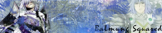
Balmung2
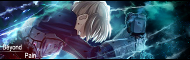
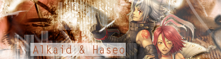
sig: 5/10 - aside from having no flow, the C4D? in the background isn't blended correctly to go with the sig. Both the focals of the sig are poorly place, i recommend the center, which in your sig, is just boring blank space. i don't like the messy 'fractal' look to it, with the random lower-opacity C4D stuck in there. Although Balmung is blended, i feel not enough.
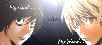
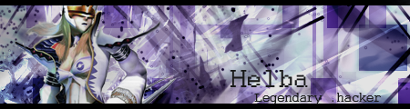
avi: 6/10 - the checkered effect looks interesting, but like Daichi's it's a tad boring, and doesn't attract too much attention.
Thanks for the criticism. That's what I look for when I come here, not "hmm it's ok" or something like that. We may not agree on everything (;p) but I'm glad you actually critiqued some of us...Oh, and on the avatar, it's a character's icon...It's a tad small, so it may not be as aparant, though I understand about the bland part.
Can you give me a good place to get c4d from, because honestly, everything I make I've done from scratch (except renders...usually -_-), and I need to start incorporating some c4d.
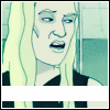
ToD
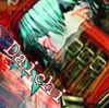
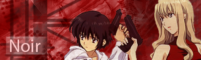
Avatar: Meh. Just Meh. If you drew that, then it's really nice, but just resized with some misplaced text. If it's not drawn, then it's slightly blurry (still is if drawn xp), and not that impressive. Boring. 4/10
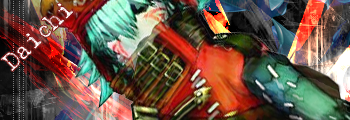
Sig: I like the colors, but again, it's so bland. I like the approach, but a little bit more substance would be nice. And the text is a bit obnoxious, especially on the name part. 4/10