ok, i'm rating every one who posted on this page...once....(slightly harsh ratings)
Mellow:
sig: 5/10 - although it's nice, it mainly looks like a render slapped on a monochromatic background. there's too much text, and the 'pixel' text doesn't fit...at all. also the name, on the sidg is way to big, it takes away from the main focal. you need blending for the render. There's good depth but the background has a pixelated effect to it. there's no real flow, to the sig, the render is too big for the dimensions, and the flow of the background doesn't match the flow of the render.
avi: 6/10 - i like the placement of the render, and the fact that you can only see a certain part, but again, there's no real blending, and not much interest, no real flow, but good depth.
Daichi:
sig (current): 3/10 - the text is WAY too big, and takes too much from the render, which is poorly positioned in the corner...terrible positioning. better placement would be more towards the center of the sig. i hate the fact that the effects cover part of the main focal's face. the depth is terrible because it covers the face, and there's absolutely no flow whatsoever. probably one of the worst i've seen in awhile from you Daichi.
sig: 4/10 - same as above, except the render is slightly more visible.
avi: 4/10 - too small, kind of boring, doesn't attract attention.
Balmung2
sig: 5/10 - aside from having no flow, the C4D? in the background isn't blended correctly to go with the sig. Both the focals of the sig are poorly place, i recommend the center, which in your sig, is just boring blank space. i don't like the messy 'fractal' look to it, with the random lower-opacity C4D stuck in there. Although Balmung is blended, i feel not enough.
avi: 6/10 - the checkered effect looks interesting, but like Daichi's it's a tad boring, and doesn't attract too much attention.
A_L_H
i can't rate, because i made them.
-Loveless-
sig: 7/10 - i'd rather not rate this one because it's Tsugasa's and you didn't give credit for his work. i'm always apposed to the 'no credit' fact. it's stealing in my opinion. but i'll rate it for Tsugasa. although the focal is nicely place...you can't see it very well, i realize it's not a good quality image, because i've attempted a sig with the same one, i didn't take points off for that. but i think there's too many effects for the real point of the sig, too much text, which takes away from the focal.
avi: 4/10 - never really liked it, looks like it was made in paint in like 10 minutes or so, i have to give it to you that it's pretty good for paint, but still fairly borings, and different.
Kyero Fox
sig (left): 7/10 - i lol'd at your 'get the **** out' sig and it's an interesting animation. the quality is decent, but the loop seems off to me, i don't know why.
sig (right): 6/10 - i don't really get it, what's it for? the stats are interesting, and it was fun to read the first time, but i seems random.
avi: 7/10 - i give you a lot of points for the high quality image, but i minus three for the fact that it's just an image resized.
------------------------------------------------------------------------------------------------------
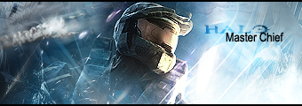
now that that's all said and done, i'd like this Halo 3 sig rated...rate it harsh as you'd like. tear it apart of you want, i'm looking for a good rating.


